


5 Simple Tips for
Mobile-Friendly Emails
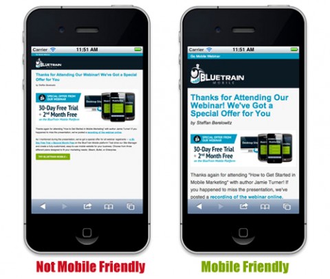
Mobile-Friendly Emails
Smartphone usage is sky-rocketing, and with it, so is the number of people that are reading email on a mobile device.
According to Litmus, 43% of email is now opened on a mobile device. That number is up 138% from 2010, and I think it’s a pretty safe bet that it’s going to continue to grow.
This means that you need to be creating emails that are mobile friendly. A mobile-friendly email is an email that displays optimally between a desktop/laptop and a mobile device, ensuring that it will look great regardless of where your customers and prospects read it.
1. Be as concise as possible in both design and content
Having a clear and concise message should be a staple of any email, but it’s even more important when designing for mobile. Screen real estate is very valuable on mobile (this is going to be a common theme), so keep the design very clean and simple and focus on the essentials.
2. Use a single column template
Because of the limited real estate you get with a mobile device, it’s generally better to use simple layouts. Often times with multi-column layouts (2 columns and more) your readers will have to zoom or scroll on their smartphone to see everything. Using a single column template will make your content much more flexible for all screen sizes.
3. Use a single, clear call to action
Make sure to include a clear call to action, and put it near the top of your email. Tell your readers what you want them to do, and make it really easy for them to do so. Whatever the action you want them to take, just make sure it’s loud and clear. And remember — with mobile, the finger is the new mouse, so make sure it’s really easy to click.
4. Avoid tiny fonts
Make sure your text can be read easily. Use a minimum of size 11pt font for body text and 22pt for headlines. We also recommend using a strong contrast of colors, like dark text on a light background. Many people turn down the brightness level on the mobile device to help conserve battery—and they are often reading on the go outside in the sunlight—so a strong contrast of colors will be easier to read.
5. Take it easy on images
Only use the images that are essential to your email. Here’s why: Apple’s iOS automatically enables images to display by default, but many other mobile device platforms—like Android—turn images off by default. If your email has a bunch of images in it, they might just look like chunks of white space. Because of this, we always recommend including image descriptions (also known as alt text) to let people know what the image is even when it’s not being displayed.
A good tip is to always preview your email and make sure it still looks great, even if none of the images are displayed.
Insight provided by Constant Contact KnowHow


