


The Reasons Readers
Trash Your Emails
Trash Your Emails
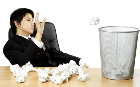
It’s heartbreaking to think that people are making snap judgements about whether or not to read your emails, based on a quick glance. So, how can you keep your email out of the trash? The secret is “Good Design”…
TOP 6 DESIGN MISTAKES
1. Missing Banner
All your professional emails should feature an instantly-recognizable, consistent header image. Over time, your header image will be associated with the high-quality information you share.
2. Hard-to-Read Fonts
Your email newsletter’s main goal is to communicate, but what if the words are hard to read? Be sure to avoid using fonts that are too small. Also, avoid combining too many different fonts as this makes your email look messy.
3. Color Catastrophes
For your email to look professional and inviting, you have to master color. Don’t use too many colors as this creates confusion and overwhelms the reader.
4. Confusing Information
When a reader glances at your email, they should know right away which information is the most important. Make this obvious by using a large, bold headlines for newsletter’s main topics.
5. Awful Images
There’s nothing that says “an amateur designed this email” like low resolution images or cheap clip art.
6. No Standard Footer
Featuring your contact information, your company mission, and your social media profiles in a consistent footer area in every email makes you look professional.
Make your emails ‘keepers’! Use these tips to create a recognizable and high quality brand experience with every message you send. It’s the best way to ensure that the great information you share doesn’t end up in the virtual trash heap.
Insight provided by Constant Contact KnowHow